Created a component system for fast cross-project adoption while preserving accessibility and implementation consistency.
Problem
Help teams bootstrap consistent interfaces quickly without rebuilding foundational UI patterns each time.
Architecture
Component-focused framework with tokenized styling, CLI distribution flows, and documentation-led usage patterns.
Implementation
Added command registry and setup aliases, expanded reusable navigation primitives, and kept dependencies current for secure adoption.
Impact
Reduced UI bootstrap effort and improved cross-project consistency through reusable primitives and automated setup workflows.
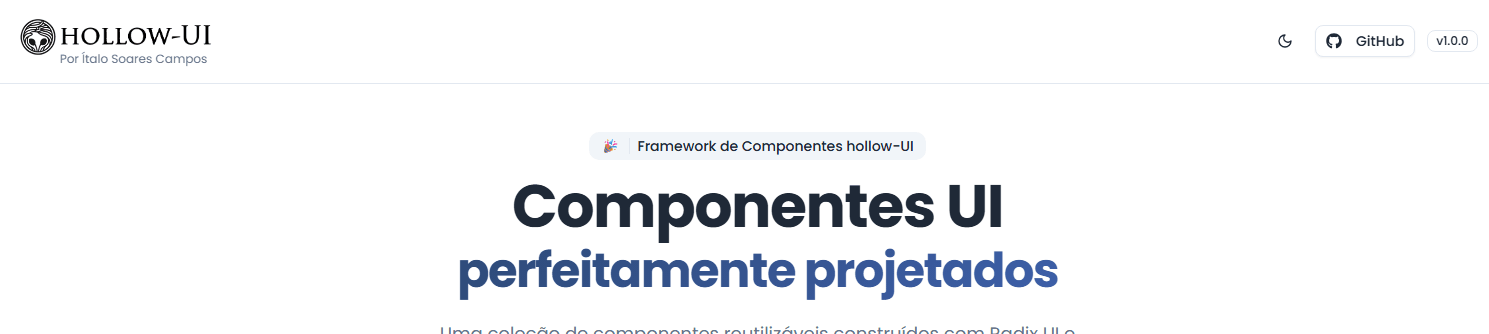
Header
Header layout designed to establish visual hierarchy, navigation clarity, and consistent spacing across the UI system.
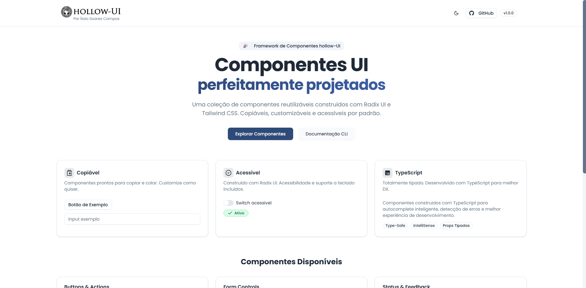
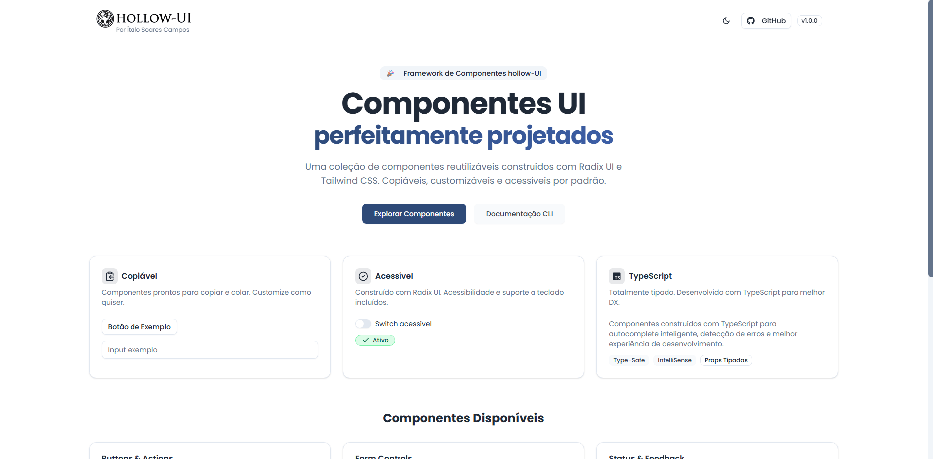
Landing Page
Landing page structure showcasing layout composition, spacing rules, and reusable UI patterns built with the design system.
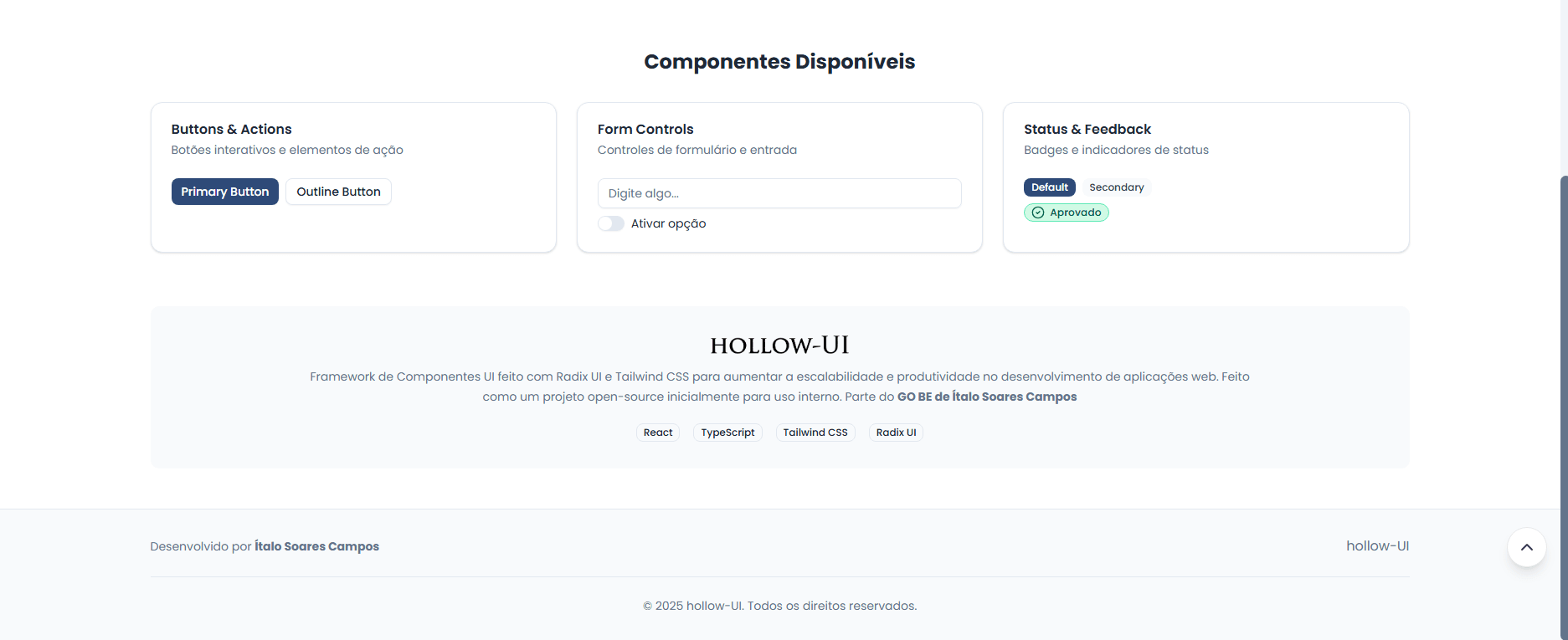
Landing Page + Footer
Extended landing page view demonstrating layout scalability and consistent component usage from header to footer.
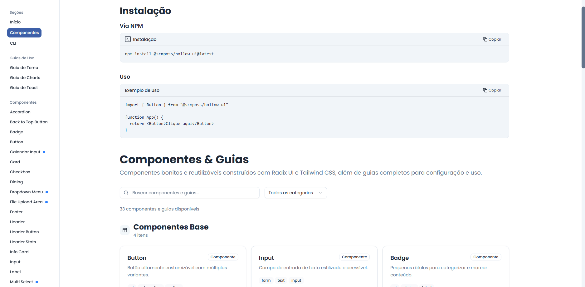
All Components Page
Centralized components catalog designed to document available UI elements and encourage reuse across projects.
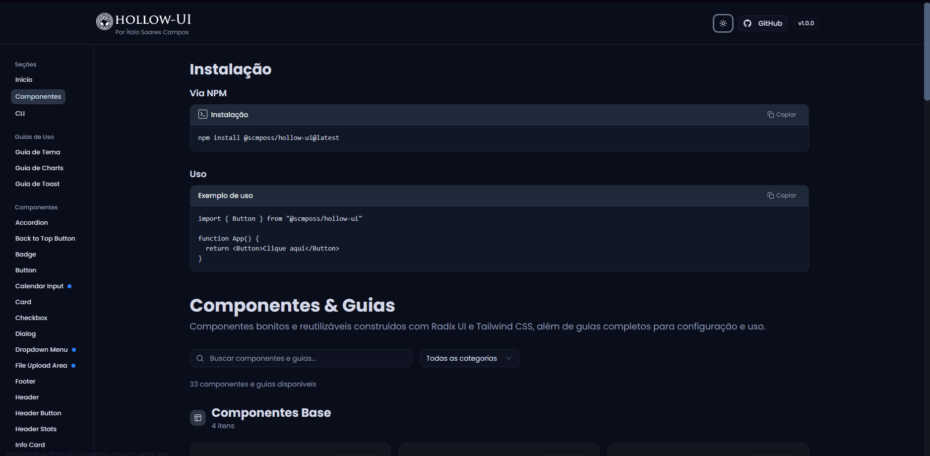
All Components Page Dark Mode
Dark mode implementation validating theme consistency and token-based styling across the entire component catalog.
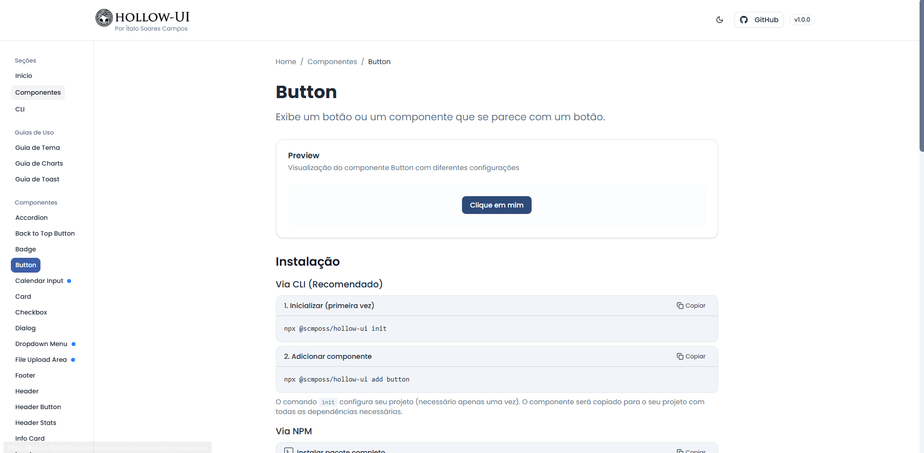
Component Page (Button Example)
Dedicated component page illustrating API clarity, variants, and usage patterns for a single UI component.
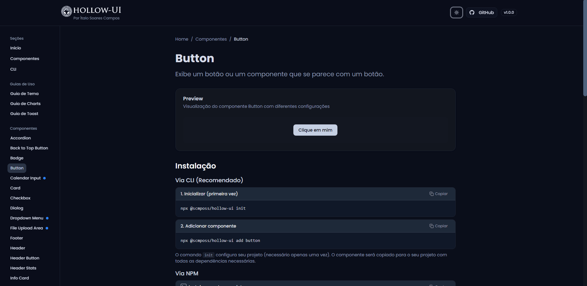
Component Page Dark Mode (Button Example)
Component-level dark mode example validating theme propagation and visual consistency at the individual component level.