A place for my writing
I built Ntu. to publish my essays, articles and studies without reducing them to short posts. I wanted each text to keep its structure, references and room for a longer argument, with a reading experience designed around that material.
The project connects two parts of my work: writing and frontend engineering. I designed the publication, structured the content model and built the reader, archive and navigation.
Content shapes the application
The publication uses local MDX with typed metadata validated by Zod. I keep the original text, publication metadata and complementary reading elements separate, so the same content can support the reader, archive, references and search.
The Markdown tree provides headings and sections for navigation and the search index. Page composition stays on the server; client-side interactions handle the tools that need browser state. Publishing stays connected to version control rather than a separate CMS.
Reading without losing the thread
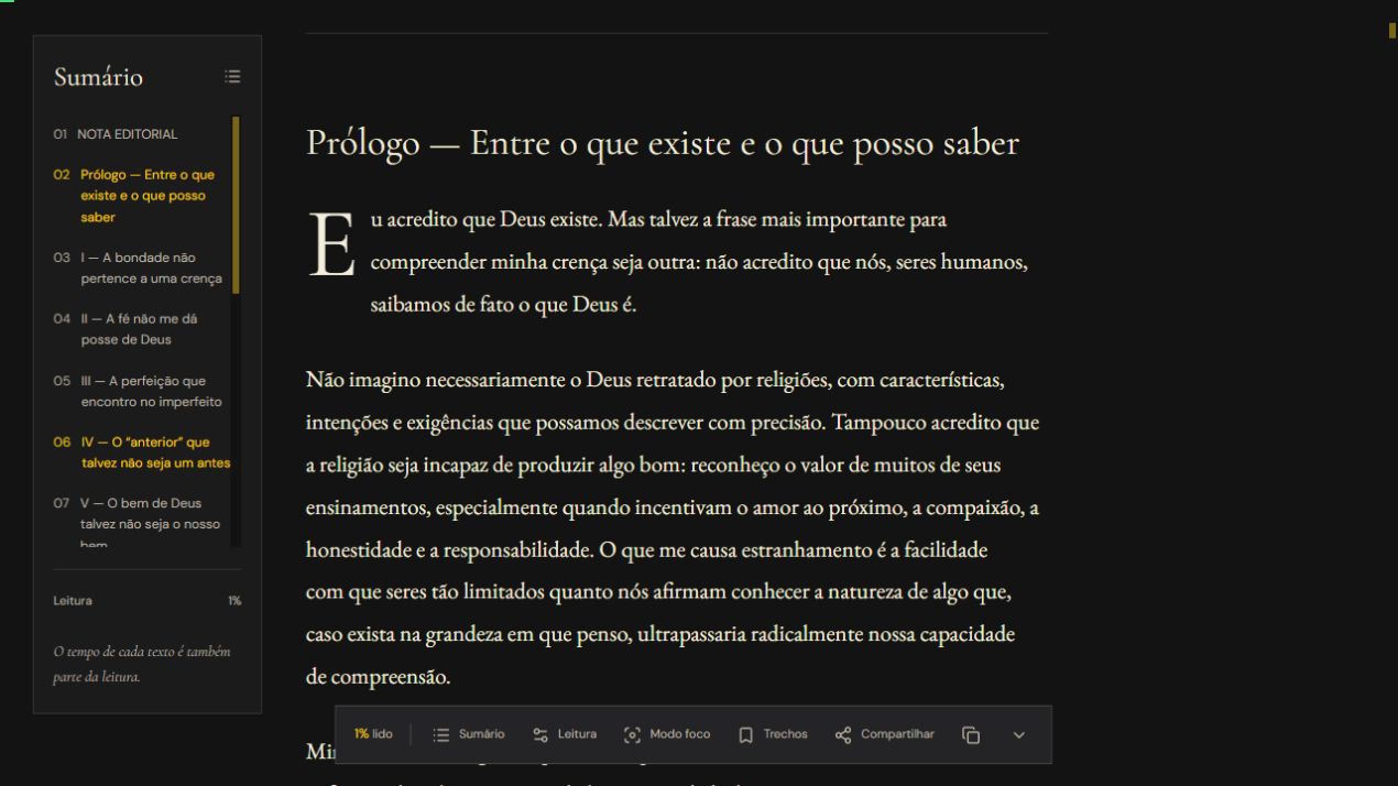
Long texts need more than a scrollbar. I built an outline linked to the current section, progress through the body of the text and a way to resume reading by section.
Notes, definitions and references keep links back to their context. Readers can adjust type size, line spacing and column width, use focus mode and save selected passages in their browser. These controls stay available without competing with the text.
I used Base UI for overlays and controls, while keeping links and media controls native where that interaction fits. The same reading flow adapts to desktop and mobile.
An editorial visual system
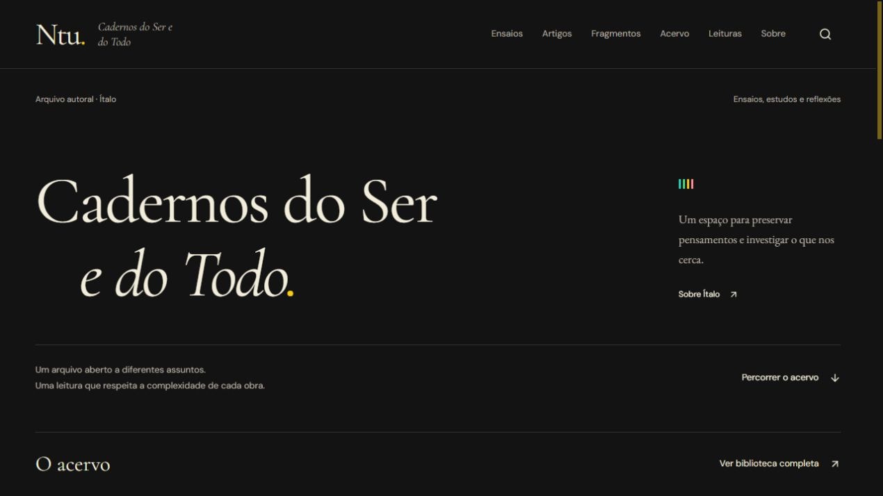
I paired Cormorant Garamond headings with EB Garamond for the body and DM Sans for the interface. The dark surfaces and restrained gold accents distinguish navigation from the reading column. Adjustable spacing and width let the reader choose a comfortable layout.
The archive offers different ways into the writing: publication types, themes, search and related readings. Ntu. is both where I publish my own work and a product through which I explore how interfaces can support close reading.